Why Colors and Fonts Are the Heart of Your Brand
Every brand starts with a feeling — calm, energetic, luxurious, or playful.
Colors and fonts are how that feeling becomes visible. They create the first impression long before a visitor reads a single word. At Visible PR, we define each project’s color palette and typography to make sure every brand feels consistent, memorable, and true to its story.
The Role of Color
Color shapes mood and emotion.
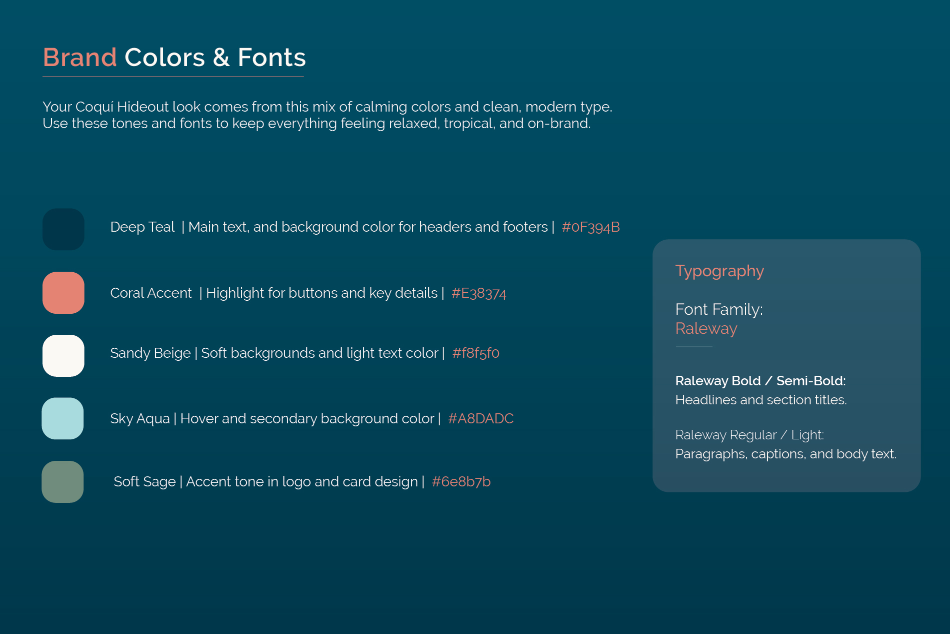
For Coquí Hideout, we built a palette that feels relaxed, tropical, and modern — reflecting Puerto Rico’s natural calm with a clean design edge.
Deep Teal — adds depth and calm; it anchors headers and footers.
Coral Accent — brings warmth and draws attention to buttons and key highlights.
Sandy Beige — soft, neutral, and perfect for backgrounds.
Sky Aqua — introduces lightness for hover effects and contrast.
Soft Sage — connects everything with a natural, grounded tone.
Together, these tones tell a story of calm sophistication — tropical without being loud.
Typography: Your Brand's Voice in Text Form
Color shapes mood and emotion.
The Raleway type family was chosen for Coquí Hideout for its clean lines and modern character — elegant but still approachable.
Raleway Bold / Semi-Bold — give structure and authority to headlines.
Raleway Regular / Light — keep paragraphs, captions, and small print airy and readable.
Just like a consistent tone of voice builds trust, consistent typography builds visual credibility.
Bringing It All Together
When your colors and fonts align, your brand begins to feel intentional. Every element — from your logo to your website and business card — starts to speak the same visual language.
At Visible PR, we help Puerto Rican businesses and vacation rentals find their look, feel, and online presence through cohesive design and storytelling that feel authentic and on-brand.
💡 Ready to define your brand identity?
Explore our branding packages or contact us for a custom project — we’ll help you create a look that feels unmistakably yours.